 |
| Main Screen + Cardapio Menu |
I previously reviewed Pinguy OS 11.10 and found that while there are certain things to which I may not be able to become fully accustomed, the "beta" label on Pinguy OS 11.10 seemed overly cautious considering its stability and high quality overall. The latest version has not changed much from that beta version besides having newer packages in general, but because version 11.10 was never truly official, the changes in version 12.04 LTS are of course huge compared to version 11.04. Also, accompanying the new release is a revamped website, which looks a lot cleaner and less bloated than before.
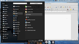
I probably would not normally seriously consider a distribution with GNOME 3/Shell for installation on my hard drive, but one of the things that caught my eye about this release was the option of using the Axe menu instead of the default Cardapio menu in the top panel. I did some searching and found out that the Axe menu looks and could potentially act almost identically to the Linux Mint Menu, which is amazing. That is why I am trying the 64-bit edition (as a live USB made with MultiSystem); sure, GNOME 3/Shell doesn't have my nice desktop cube, but it could potentially have everything else I could want, and given that, I'm OK with giving up the desktop cube if I am left with no other good alternatives. Follow the jump to see what this is like.
 |
| Mozilla Firefox |
Mozilla Firefox still looks and acts much the same as it did before, and all the other things apply as well. However, it does not give an option like it did before to disable certain extensions before starting; while that isn't a huge deal, it was a nice touch, so I'm a little sad to see that go.
 |
| LibreOffice Writer + Axe Menu |
Redshift was installable from the repositories. After logging out and logging back in, that worked fine too.
Because all the other dependencies are already present, Mupen64Plus 1.5 was installable just by extracting the TAR package and running the installation script. It took several minutes for it to be added to the application menus, but it ran fine, and it ran all of my games perfectly fine, which is a good sign.
Nautilus is mostly the same as before, and Gloobus-Preview is included as before. I'm now a little surprised as to why that might be, considering that GNOME now has a native file previewer in the form of Sushi, which works exactly like Gloobus-Preview does. In any case, Gloobus-Preview works as well as it always did, and it doesn't seem to have the stability problems present in the version from the PPA for daily builds, so I wonder which source is used for Gloobus-Preview. Also, Nautilus no longer hides the side pane even when the view mode is split, which is a nice progression from before.
 |
| Activities Overview |
One extension that is installed is the Auto-Move-Windows extension, which allows the user to force certain applications to start on specified virtual workspaces. Unfortunately, despite being enabled, GConf-Editor has no way to configure it, and anyway it seems like the dynamic workspaces in GNOME 3/Shell would preclude such an extension from working properly.
One of the advantages that I see in GNOME 3/Shell versus GNOME 3/Cinnamon (which is probably the closest production-ready GNOME 3 environment I have seen that aims to emulate the GNOME 2 interface) is added stability. Indeed, GNOME 3/Shell was quite stable on the whole. That said, there were a few small bugs. Switching workspaces seems a little jumpy. Starting some applets seemed a little jumpy, and configuring applets made some weird things happen like the active window title button in the panel enlarging itself (though those issues fixed themselves after a few seconds). The weather applet would not recognize the WOEID I typed in. One applet made a gray blocky artifact appear on the screen for a second, though that never happened again. Also, unrelated to GNOME 3/Shell, the screenshot applet Shutter would throw an error message after each screenshot taken (though without consequence to anything at all).
 |
| Synaptic Package Manager + Desktop Customizations |
That is where my time with Pinguy OS ended. The nonfunctional Auto-Move-Windows extension combined with the various other bugs and quirks means that I probably would not install it, although the Axe menu did make the deal seem quite a bit more enticing. But it seems great for an average user as always, and I can give it a rather high recommendation because of how well it manages to turn GNOME 3/Shell into a more traditional-looking desktop and because of all of the applications and other user-friendly tweaks and goodies present.
You can get it here.