 |
| Pear OS: Main Screen |
Pear OS takes no shame in aping absolutely every part of Apple's Mac OS X. Its slogan is "Think Totally Different", which is an obvious rip off of Apple's slogan, "Think Different". Its logo is a pear into which someone has taken a small bite. It shows box art that clearly apes that of Apple's Mac OS X. Even the version name is "Panther", which is actually a past release of Apple's Mac OS X ( The list goes on, but it's clear what the developers are aiming at.
By contrast, Zorin OS is quite a bit more subtle about its goals. It explicitly states that it aims to bring Linux to Microsoft Windows users, but its website is a bit more generic in that it simply states the advantages and features of Zorin OS without directly referencing Microsoft Windows too many times.
 |
| Zorin OS: Main Screen + GnoMenu (Microsoft Windows 7 look) |
Pear OS 3.0 "Panther"
After the boot menu, I was greeted by a boot splash containing the Pear OS logo and a spinner on a gray background. This is not too surprising. After that came the desktop.The desktop is supposed to be built on GNOME 3, but it looks surprisingly like GNOME 2. There is a panel on top and a dock on the bottom. The panel contains, from left to right, a system menu (given by the Pear OS logo), a global menu, and a system tray. The fact that the Pear OS logo brings up a system menu rather than an application launching menu (as in, say, Pinguy OS) makes it much closer to the operation of Apple's Mac OS X, which is good in that sense.
 |
| Pear OS: Opera |
There is one thing to note: Slingshot actually came before Launchpad thanks to the good work of the Elementary OS developers, so it's not fair to say that Slingshot is a copy of Launchpad.
The Metacity/Mutter window titlebar theme appears to be the Elementary theme. I'm not sure what the GTK+ theme is, but it fits in very well. The icon theme is Faenza-Mac. Overall, the desktop looks very well put together, and it makes a pretty convincing Mac OS X lookalike.
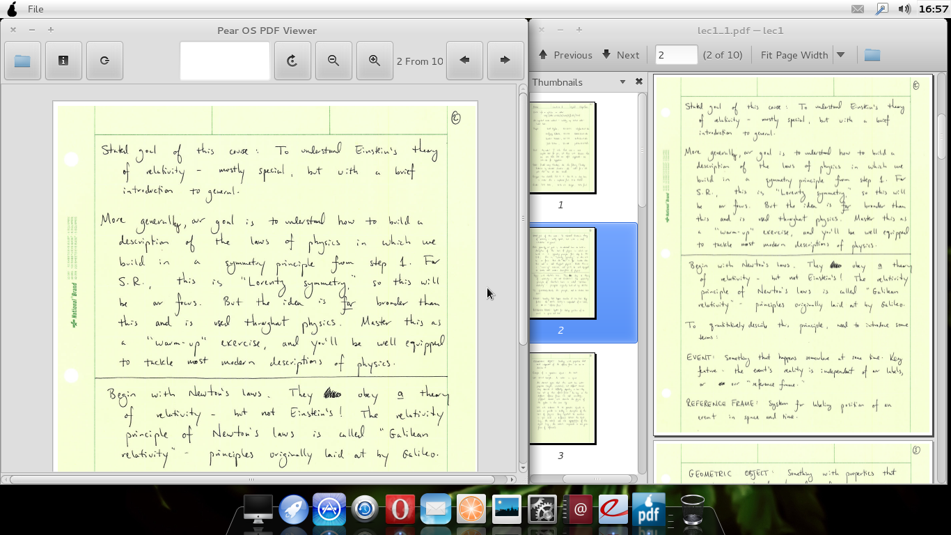 |
| Pear OS: PDF Files in Evince & "Pear OS PDF Viewer" |
Pear OS 3.0 "Panther" uses GNOME 3, so a lot of the applications have become unbranded, which is good. For example, the GNOME 3 System Settings application is just called "System Settings", while GNOME 3 Contacts is just called "Contacts". This is good in terms of not giving away the distribution's roots.
There actually isn't much more in the way of similarities left for me to talk about, so I'll move onto complaints and suggestions for the next release. Most of these have to do with minor bugs and differences from Apple's Mac OS X, because if the developers chose to take the similarities this far, what's the point of not going all the way in creating a Linux-based clone of that OS?
The first few things have to do with the dock. For one, it doesn't appear to have quite the right theme. I think there are other themes that would look a little more convincing. For another, it seems to be missing things like the "Stacks" applet. I'm going to guess this particular dock is Docky, so I think Cairo Dock would have been a better choice.
There are a few applications that look a little unpolished/out of place. Clementine looks a little poorly-integrated, and the "Pear OS Mail" actually turns out to be Sylpheed Mail, as given by the window title. I think both could use a little better integration into the rest of the desktop.
The "Pear OS Appstore" is just the Linux Mint Software Manager. This in itself is not an issue, but it does show that the distribution comes from France, because large portions of the application are shown in French. I would prefer that such issues be ironed out as soon as possible.
 |
| Pear OS: "Appstore" |
When Slingshot is open, the global menu is still available for some odd reason. However, clicking it causes a few (easily resolvable) hiccups with the desktop. Hopefully that buggy behavior will be fixed soon. Speaking of the global menu, it appears to be incompatible with Opera. Maybe it's time to switch to another browser...?
Pear OS includes Sushi, the new built-in GNOME 3.2 file previewer. Although all other windows have their controls on the left, Sushi has the close button on the right. What's with that?
Finally, why not go all the way with the appearance? I like the icon theme, but the GTK+ and Metacity/Mutter themes don't scream "Mac" like the rest of the desktop. I know there are one or two Aqua-like themes available for GNOME 3, so why not enable those? That's something I'd like to see in the next release.
So there were a number of complaints I had after all, but in all fairness, Pear OS is a relatively young project. I have no doubt that there will only be improvements in the next release, and it's worth congratulating the developers over a job well done.
Zorin OS 5.2 Core
After the boot menu, I was greeted by...a black screen. It looks like these blank boot splashes are trendy these days. Anyway, shortly after that, I was greeted by the desktop. |
| Zorin OS: Google Chrome + DockBarX (Microsoft Windows 7 look) |
Google Chrome (rather than Chromium) is the default browser, and multimedia codecs seem to be included here as well. In addition, the volume keyboard shortcuts worked fine. One nice thing is that Zorin OS includes a browser chooser, which allows the installation of other web browsers, like Mozilla Firefox, Opera, and Midori, along with the possibility of uninstalling Google Chrome. It's nice because then users may never need to touch the package manager (which is a rebranded Ubuntu Software Center as it existed about a year ago).
 |
| Zorin OS: LibreOffice Writer + Nautilus + Desktop Cube (Microsoft Windows 7 look) |
As Zorin OS is based on Ubuntu 11.04 "Natty Narwhal" (as far as I can tell) rather than Ubuntu 11.10 "Oneiric Ocelot", it uses GNOME 2, so it can use Compiz as its WM. Desktop effects, like the desktop cube, worked very well, and a large number of effects seem to be enabled from the get-go. In fact, closing a window or the GnoMenu causes it to explode into a bunch of pieces, which is a cool effect.
 |
| Zorin OS: Eye of GNOME + GnoMenu (Microsoft Windows XP look) |
So after having looked at both distributions, I've come to realize that perhaps this comparison wasn't entirely fair. Pear OS is a younger project, uses GNOME 3 (which is known to be harder to customize), and aims to almost completely ape Apple's Mac OS X from top to bottom, so despite its best efforts, it invariably falls short. Plus, its youth means that some bugs, like the French-language Linux Mint Software Manager, are added to the mix. By contrast, Zorin OS is a much more mature project, uses GNOME 2, and aims only to provide a similar interface to that of Microsoft Windows. Hence, Zorin OS will of course meet its goals much more easily than Pear OS will meet its goals, because Pear OS has to meet much higher expectations (in my mind at least). That's why I think this may not be an entirely fair comparison. With all that said though, I think Zorin OS feels like a much more polished, less buggy, and well put together product than Pear OS, and I think newbies would rather take a souped-up Microsoft Windows 7 lookalike than a stripped-down and slightly buggy Mac OS X lookalike. So Zorin OS wins this one, but I'll keep an eye on Pear OS for sure.
You can get Pear OS here, and you can get Zorin OS here.